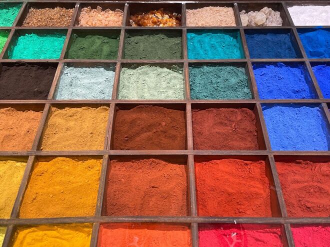
The Chemistry of Scarcity Behind Masterpiece Canvases
The aesthetic triumphs of the Italian and Northern Renaissance were never the result of unbounded artistic choice. Every blue, red, yellow, and brown was conditioned by geology, labor, commerce, and risk. A painter could imagine an intense blue, but access to that blue depended on distant mines, caravan routes, maritime merchants, local grinding practices, and a patron willing to pay. The finished image therefore records more than iconography or style. It also records the physical limits of the earth and the economic systems that moved its materials.
Early modern workshops operated as artisanal laboratories. Apprentices processed clays, stones, metal compounds, insect-derived dyes, and organic binders, reducing raw matter to usable color through roasting, washing, levigation, and repeated grinding. For artists and conservators today, historical pigment research reveals how mineral structure, particle size, and binder chemistry shaped both appearance and survival. Geography established scarcity, scarcity established price, and price helped determine which figures received visual emphasis. A costly pigment was not simply decorative. It was a material signal of rank, sanctity, and patronage.

Geology Dictates the Palette from Sienese Clays to Toxic Minerals
Earth pigments formed the dependable bedrock of Renaissance painting. Red and yellow ochres, based largely on iron oxides and iron-bearing clays, were widely available, comparatively inexpensive, and chemically adaptable. Raw umber, containing iron and manganese oxides, supplied cool, transparent browns, while burnt umber became darker and warmer after heating. Sienna, associated historically with the Italian region around Siena, also gained its characteristic reddish quality through iron-rich earth and calcination. These materials supported underpainting, shadows, architecture, hair, flesh modulation, and the controlled tonal structures on which more expensive colors could be layered.
The apparent simplicity of an earth color concealed considerable technical knowledge. A pigment’s hue depended on mineral impurities, geological formation, preparation, and particle size. Coarse particles could create a granular, tactile surface, while finer fractions offered smoother passages and greater opacity. Artists and workshop assistants had to judge whether a material was clean enough for a particular passage, whether it would discolor in oil or tempera, and whether its refractive behavior suited a transparent glaze or an opaque highlight.
| Material | Chemical family | Historical role | Principal concerns |
|---|---|---|---|
| Red and yellow ochre | Iron oxides and hydrated iron oxides | Grounds, flesh, drapery, architectural passages | Natural variation in hue and opacity |
| Raw and burnt umber | Iron and manganese oxides | Underpainting, shadows, neutralized mixtures | Darkening and binder-dependent changes |
| Sienna | Iron-rich earth | Warm flesh tones and transparent modeling | Regional variation and heat treatment |
| Azurite and malachite | Copper carbonates | Blue and green passages | Conversion, coarseness, and sensitivity to technique |
| Cinnabar or vermilion | Mercuric sulfide | Brilliant reds and emphatic details | Toxicity and potential darkening |
| Orpiment and realgar | Arsenic sulfides | Vivid yellow and orange-red accents | Severe toxicity and incompatibility with some pigments |
The most brilliant mineral colors demanded the greatest caution. Realgar and orpiment, arsenic sulfides, produced unusually forceful orange-red and yellow tones but exposed workers to poisonous dust during crushing and grinding. Cinnabar, the mineral form of mercuric sulfide, offered a saturated red that became vermilion when prepared or manufactured, yet mercury exposure made its handling hazardous. Workshops needed enclosed procedures, careful washing, and disciplined separation of materials. The color’s prestige was inseparable from the danger embedded in its preparation.
Venice and the Maritime Choke Points of Pigment Commerce
Venice’s role in Renaissance color was a direct consequence of geography. Built across mud flats and islands in a lagoon, the city possessed natural defensibility and a dense network of navigable canals. Its position linked the Italian peninsula with the Mediterranean, northern Europe, and eastern trading zones. As the National Gallery’s account of Venice explains, canal-facing buildings could function as commercial premises, bringing storage, brokerage, craft production, and distribution into close proximity.
Among the city’s specialists were the vendecolori, or color sellers. These merchants were more than retail intermediaries. They helped establish expectations about pigment quality, grade, origin, and preparation. A painter purchasing blue or red material needed to know whether the substance was suitable for a thin glaze, an opaque field, or a prestigious commission. In a market where natural materials varied from shipment to shipment, merchants became essential translators between geology and workshop practice.
- Venetian ports connected imported stones and minerals with regional workshops.
- Specialist color merchants sorted, prepared, and circulated materials according to quality.
- Canal-based commerce reduced the distance between shipment, storage, and artistic production.
- Maritime disruption could raise prices or interrupt access to colors across Italy and beyond.
- Venice’s commercial dominance weakened after new oceanic routes altered the balance of global trade.
These bottlenecks affected style as well as supply. A Central Italian workshop might rely heavily on earth colors and locally available copper minerals, while a Venetian painter with stronger access to imported materials could build compositions around more expensive blues and glazes. Titian’s use of ultramarine in Diana and Actaeon signaled the wealth of the commission, while his combination of ultramarine and azurite in Bacchus and Ariadne demonstrates that color decisions could involve both prestige and practical economy. Pigment commerce thus entered the structure of composition itself.
The Economics of Lapis Lazuli and Sacred Hierarchy
Lapis lazuli was the clearest example of geology becoming social hierarchy. The finest material used for European ultramarine came from mines in Badakhshan, in the region of present-day Afghanistan. From there, the stone moved through complex overland networks associated with the Silk Road before reaching Mediterranean markets and, often, Venice. The journey imposed costs at every stage: extraction, transport, sorting, brokerage, grinding, and loss. A blue passage on a panel could therefore embody a chain of labor stretching across continents.
Contracts could specify the weight and quality of ultramarine because not all blue stone produced the same result. Lapis contains lazurite, the mineral responsible for its blue, alongside pale calcite and metallic pyrite. The most prized pigment required the removal of these unwanted components. Its rarity made it particularly suitable for the Virgin Mary’s mantle, where color functioned as a visual theology of honor and purity. The restriction was not always absolute, but it was common enough to establish a recognizable hierarchy: costly blue belonged to the most important figure or passage unless a patron explicitly funded broader use.
- The lapis was broken and ground into a coarse powder.
- The powder was mixed with a binding medium, traditionally involving waxes, resins, or related substances.
- Repeated kneading and washing separated blue lazurite particles from calcite and pyrite.
- The extracted fractions were graded, with the strongest blue commanding the highest price.
- The resulting ultramarine was incorporated into compatible binders and applied in carefully planned layers.
This pastiglia, or extraction process, was technically laborious and economically consequential. The painter was not merely buying a color but paying for a refined concentration of a specific mineral phase. Particle size also mattered. Finely prepared material could behave differently from larger particles, affecting opacity, texture, and the depth achieved in layered applications. The continuing attraction of lapis is visible in contemporary practices such as Hamra Abbas’s stone inlays, where the material remains an archive of mining, circulation, labor, and cultural memory rather than a generic blue surface.
Synthetic Chemistry Liberates the Modern Palette
The Industrial Revolution disrupted the old geography of color. Nineteenth-century discoveries and manufacturing processes introduced reliable alternatives to scarce or dangerous natural materials. Cobalt colors, synthetic ultramarine, chrome-based pigments, and cadmium pigments expanded the painter’s practical options, while improved milling and the metal paint tube made prepared color more portable and consistent. The result was not simply a larger color chart. It was a new relationship between artistic intention and material access.
Historical minerals and modern pigments differ in ways that remain crucial to artists and conservators. Natural minerals often contain varied inclusions and irregular particle structures, producing distinctive texture and optical complexity. Their refractive behavior can create a particular density in glazes or a granular luminosity in opaque passages. Modern inorganic pigments such as cadmiums and cobalts can offer strong saturation, dependable composition, and useful stability, although toxicity and handling requirements still apply. Synthetic organic compounds, including quinacridones, phthalocyanines, and dioxazines, can provide intense, transparent colors that were unavailable to most Renaissance painters.
- Mineral pigments: valued for earthy mixtures, opacity, weight, and natural variation.
- Modern inorganic pigments: valued for strong color, consistency, and a broad range of stable hues.
- Synthetic organic pigments: valued for transparency, high chroma, and efficient glazing.
- Historical materials: valued for tactile irregularity, layered depth, and connection to period practice.
Modern access does not make historical materials obsolete. Fine artists who return to lapis lazuli, azurite, malachite, or cinnabar often seek a physical behavior that cannot be fully reproduced by a convenient substitute. Grinding and levigation expose differences in particle size, while translucent layers can generate a crystalline depth distinct from the uniformity of many manufactured colors. Yet responsible use requires contemporary safety standards, accurate labeling, and awareness that historical authenticity is not worth preventable exposure to arsenic or mercury. The strongest revival treats old materials as technical evidence, not as romantic relics.
Rediscovering Material Truth in the Heritage of Color
Renaissance masterpieces remain permanent records of planetary geology and global merchant routes. An ochre ground points toward local iron-rich earth; an ultramarine mantle points toward Afghan mines and long-distance exchange; a red accent may reveal access to cinnabar, arsenic sulfide, or an organic dye vulnerable to light. Conservation science now uses spectroscopy, microscopy, and related analytical methods to identify these materials, reconstruct workshop practices, and distinguish original passages from later interventions.
Viewing early modern painting through material constraint corrects the modern assumption that artists always possessed unlimited choice. For creators, it encourages deliberate attention to opacity, refractive index, particle size, binder compatibility, and the social meaning of color. For audiences, it turns looking into a more informed encounter with labor and infrastructure. The next time a blue mantle dominates a Renaissance composition, its force can be understood not only as symbolism or style, but as the visible outcome of a stone, a route, a contract, and a carefully controlled transformation from earth into image.