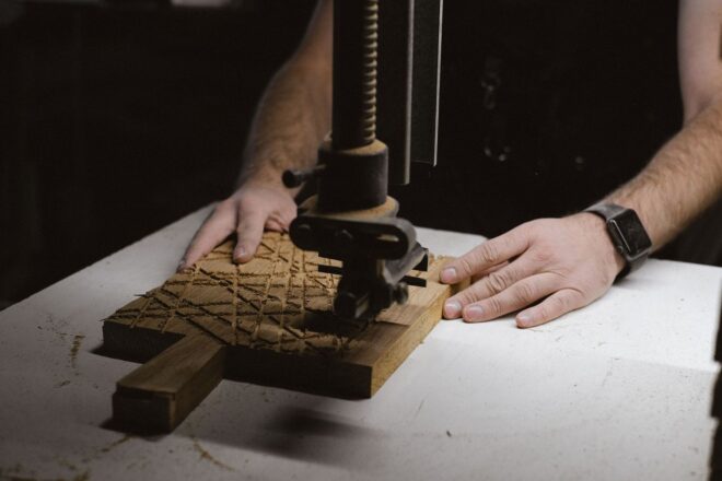
The Physical Battle of the Relief Matrix
For an independent release, the matrix is not a neutral container for an illustration. It is an active production partner. The block determines how quickly a gouge moves, where a line breaks, how much force a press requires, and whether a field of ink arrives as a dense statement or a broken, atmospheric trace. That matters on a gig poster, a limited vinyl sleeve, an artist book, or any printed object whose value depends on evidence of the hand.
Wood introduces an organic cellular architecture that the tool must negotiate. Its fibers run in directional systems, change density, and respond differently depending on whether the cut travels with, across, or against the grain. Linoleum, by contrast, offers a more isotropic surface. Its composition, commonly based on linseed oil and fibrous fillers mounted on a backing, presents a comparatively uniform resistance, allowing blade angle and pressure to remain more predictable across different vectors. Professional linoleum products are specifically valued for defined profiles and compatibility with several ink types, as described by professional linoleum block manufacturers. For a broader technical reference, an Authoritative Source can help clarify how these material differences shape the finished impression.
That distinction separates generic commercial reproduction from tactile fine art printmaking. A rough edge is not automatically expressive, and a clean edge is not automatically superior. The serious question is whether the physical behavior of the matrix supports the emotional and commercial job of the image. For a label, that means connecting substrate choice to artist positioning, edition size, production schedule, and the kind of audience relationship the object is intended to build.
Cutting Mechanics and the Mechanics of Blade Resistance
Wood and linoleum create fundamentally different cutting conversations. Wood is anisotropic, meaning its resistance changes with direction because cellulose fibers are arranged along the grain. A gouge moving parallel to those fibers may travel easily, then suddenly catch when it meets a knot, a denser band, or a change in grain direction. Linoleum is comparatively homogeneous and grain-free. The blade still encounters resistance, but that resistance is less dependent on compass direction, making curved contours, cross-hatching, and repeated geometric marks easier to plan.
In wood, lateral tear-out occurs when the tool lifts or separates fibers beyond the intended boundary. This can enlarge a cut, collapse a narrow shoulder, or remove a fragment that was meant to remain as a printing line. Side-grain basswood, limewood, and Japanese Shina plywood are often chosen because their relatively manageable structure supports controlled carving. End-grain wood, used in wood engraving, can support much finer detail because the blade works across the ends of fibers, although the method demands different tools, greater control, and a more deliberate cutting rhythm.
Linoleum generally permits clean multidirectional shearing, but its ease can be deceptive. A sharp tool may accelerate through soft material and travel farther than expected, so hand position, cutting direction, and a stable work surface remain essential. Wood tends to slow the blade and increase muscular effort, while lino can encourage excessive speed. In both cases, the ergonomics of the process affect the final mark. A shallow, well-supported gouge angle can preserve an edge and reduce torque; a steep angle may bite aggressively, strain the wrist, and leave a shoulder vulnerable to collapse during printing. Regular honing matters because a dull edge does not simply cut less well. It demands more force, increases tear-out, and makes the artist less able to distinguish deliberate texture from mechanical damage.
- Wood rewards directional planning and deliberate cuts around grain changes.
- Linoleum supports predictable curves, cross-directional marks, and faster block preparation.
- Sharp tools reduce force, improve edge control, and lower the risk of accidental overcutting.
- Stable registration protects both the printer and the matrix when repeated pressure is applied.
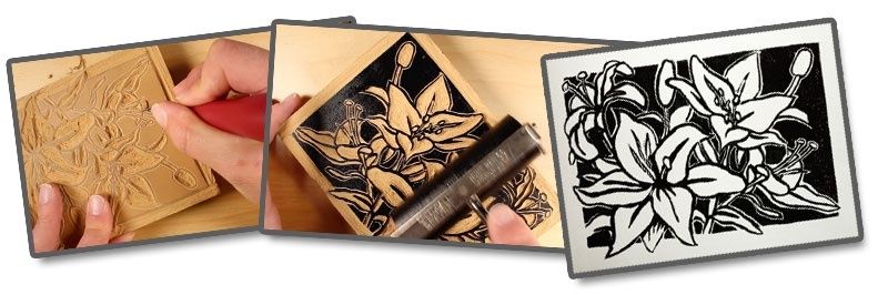
Relief printing should also be distinguished from processes that place ink in recessed lines or rely on a chemically treated flat surface. The academic definitions of printmaking techniques explain how relief methods leave raised areas to receive ink, while intaglio transfers ink from incised areas under much stronger pressure and planographic methods depend on surface chemistry rather than carved height. That structural difference is central to choosing tools, paper, and press settings.
Structural Fidelity and Fine Line Endurance Under Pressure
Edition planning changes the matrix decision. A one-off artist proof can tolerate a fragile shoulder or a deliberately unstable patch of texture. A run of several hundred numbered sleeves, posters, or book covers cannot. Repeated inking and pressure gradually polish raised surfaces, compress delicate edges, and expose weaknesses that may not appear in the first proof. Wood can deliver extraordinary character, but narrow raised lines aligned with the grain may chip or split. Linoleum often offers more consistent line behavior across a hand-printed edition, although fine features can still deform if the relief is too shallow or the block is overworked.
Sub-millimeter cross-hatching requires particular attention to shoulder geometry. A line is not merely a groove in the block; it is a raised ridge whose sides must withstand rolling ink, paper drag, and platen or press pressure. The following comparison is a practical starting point rather than a substitute for proofing, because actual results depend on species, block density, tool sharpness, ink viscosity, paper, and press calibration.
| Factor | Wood matrix | Linoleum matrix |
|---|---|---|
| Line sharpness | Can be highly precise, with grain contributing visible character | Typically clean and consistent in multiple directions |
| Fine cross-hatching | Strong when grain and cut direction are carefully managed; vulnerable to tear-out | Predictable for tight patterns, though very narrow shoulders remain fragile |
| Pressure tolerance | Varies with species, grain orientation, and raised-line support | Generally uniform, but excessive pressure can compress or distort relief |
| Run consistency | May develop organic variation as fibers polish or chip | Usually offers more repeatable impressions across a moderate edition |
| Maintenance | Requires careful sharpening and grain-aware handling | Requires sharp tools, clean edges, and protection from heat or deformation |
Ink Film Split and Surface Absorption Dynamics
Cutting determines the architecture of the image, but the matrix surface determines how that architecture speaks on paper. Raw lumber has micro-porosity, and the behavior changes between side-grain and end-grain surfaces. Ink can settle into tiny irregularities, while ridges in the grain interrupt the roller”s film. The result may be a subtle form of ink starvation, particularly in broad areas where the printer expects a continuous black. That broken coverage can be a liability for a clean brand system or a powerful asset for a noisy, distressed visual identity.
Dense linoleum tends to produce a more level inking surface. It does not eliminate variation, because roller pressure, ink tack, paper absorbency, block temperature, and hand pressure still matter, but it can support dense, mirror-flat solids more readily than rough or open-grained wood. This is especially relevant when printing on heavy cotton rag papers, which can absorb a significant amount of the ink film and may require a carefully balanced combination of tack and viscosity. Excessively tacky ink can pull fibers or disturb delicate relief; ink that is too loose may flood narrow channels and soften the image.
Paper is part of the matrix system, not a passive destination. A dense block with a crisp shoulder may still print weakly on an absorbent sheet if the film is too thin. Conversely, a coarse wood surface can appear intentionally rich when paired with a paper that accepts uneven deposition without turning it into a muddy blur. The correct evaluation takes place in the finished impression, viewed at normal reading distance and under the lighting in which the sleeve, poster, or book will actually be encountered.
- Proof the untouched matrix with the intended ink and final paper, not only with inexpensive copy stock.
- Inspect both solids and hairlines, checking whether broad areas starve while narrow ridges fill or spread.
- Adjust one variable at a time, such as ink tack, roller pressure, paper dampness, or hand pressure.
- Compare early and late proofs to identify polishing, compression, chipping, or gradual loss of detail.
- Record the winning settings so an edition can be repeated without relying on memory.
Historical printmaking records show that technique, material, and surface effect have always been intertwined. The V&A archive on printmaking techniques offers useful documentation of how relief, intaglio, and related processes produce distinct visual results. For contemporary makers, that history is practical rather than decorative: absorption patterns, pressure, and raised-surface geometry remain active authors of the image.
Curating the Emotional Timbre for Independent Releases
Woodcut tension is particularly effective when the release needs to feel physical, urgent, or resistant to polish. The broken contour and directional grain can echo the compression of hardcore, the rawness of noise, the political charge of expressionist poster work, or the handmade scarcity of a short-run artist edition. A wood matrix can make a title look as though it has survived pressure. That perception has value when the physical object is intended to deepen the audience”s connection with an artist rather than merely reproduce a digital campaign asset.
Linocut offers a different kind of authority. Its crispness suits geometric typography, modular symbols, hard-edged silhouettes, and packaging that must remain legible across a record sleeve, social crop, merchandise tag, and small book cover. For an art director, the choice is a strategic decision rather than a question of taste alone. Consider the following:
- Choose wood when visible grain, pressure marks, and controlled irregularity reinforce the artist”s emotional position.
- Choose linoleum when clean contours, reliable solids, and quick revisions support a precise contemporary identity.
- Choose a hybrid approach when a distressed hero image needs to coexist with highly legible type or catalog information.
- Plan around edition size, because a substrate that is beautiful for fifty impressions may be inefficient or unstable for five hundred.
Turnaround speed also affects creative control. Linoleum can reduce the time between concept, carving, proof, and approval, which matters when an independent label is coordinating manufacturing, distribution, press outreach, and a release date. Wood may require more preparation and more proofs, but that slower process can become part of the object”s value. The strongest campaigns make the constraint visible without allowing it to undermine readability, production reliability, or catalog consistency.
Mastering the Matrix to Elevate Your Next Edition
The essential trade-off is between biological grain and isotropic composure. Wood offers directional resistance, fiber variation, and a naturally unstable vocabulary that can make every impression feel materially alive. Linoleum offers a more even field in which the artist can control contour, spacing, and solid coverage with fewer surprises. Neither medium is inherently more serious. Each makes different promises to the hand, the press, the paper, and the audience.
Before committing to a full edition, cut a small representative panel containing a heavy black, a thin outline, sub-millimeter hatching, a curved letterform, and a textured open field. Print it on the final stock using the intended ink and pressure. Examine the first, middle, and late proofs, then note where edges soften, solids break, paper fibers lift, or grain introduces useful variation. That protocol turns material uncertainty into production knowledge. More importantly, it lets the matrix become a deliberate expressive co-author, so the friction of making is not something to conceal but a controlled part of the release”s identity.