
Rethinking the Printed Page as Spatial Art
For independent artists, small presses, graphic designers, and record labels, the printed page no longer has to behave like a passive container for information. It can become a structure, a sequence, a surface, and an object with its own physical logic. The artist”s book occupies that productive space between publication and sculpture, where reading is not simply an act of decoding text or images but a process of opening, unfolding, turning, lifting, touching, and discovering.
This shift matters in an independent music culture saturated with digital files and rapidly consumed content. A tactile book, lyric object, tour publication, or limited release companion gives an audience something that cannot be reduced to a screen image. Paper weight, exposed thread, an awkward fold, a translucent insert, or a cover that changes shape in the hand can make a release feel intentional and emotionally durable. The history of artists and the book shows how creators have repeatedly treated the codex as an immersive medium rather than merely a vehicle for text. Today, that tradition offers independent publishers a powerful route toward deeper audience connection, stronger label identity, and collectible catalog value.
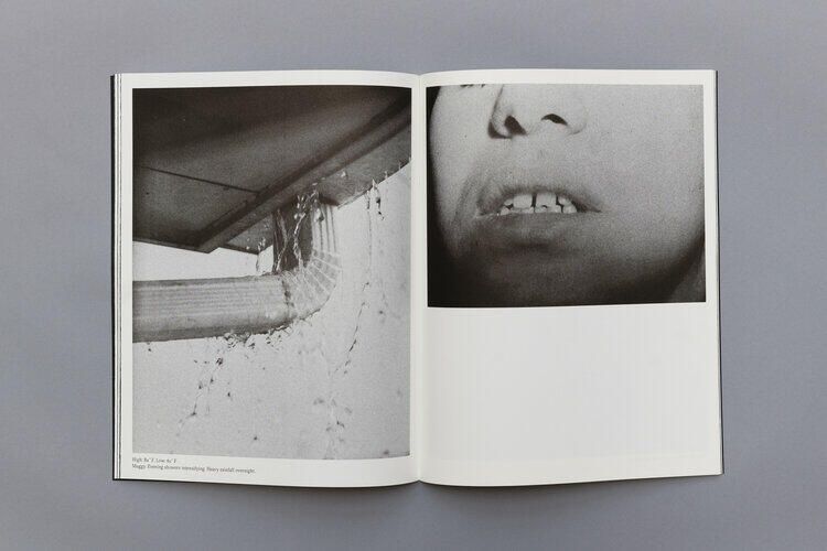
Structural Mechanics and the Spatial Codex
The architecture of an artist”s book begins with the way it moves. A conventional adhesive binding tends to conceal its mechanics, encouraging the reader to focus on the printed surface. By contrast, a non-adhesive structure can make sewing, folding, lacing, and layering visible. An exposed spine declares that the object has been made, not merely manufactured. An accordion can stretch a single visual passage across a table. A folded section can require the reader to change grip and orientation before the next image becomes legible.
Different structures create different forms of pacing. Japanese stab stitch produces a restrained, graphic spine with visible thread along the outer edge, although its pages may not open completely flat. French fold sections create concealed page edges and opportunities for surprise, since the reader may need to cut or open folded leaves to access the work. Long stitch binding leaves sewing prominent on the spine and can support a flexible, tactile volume. These choices are not decorative afterthoughts. They shape how a listener experiences a lyric sequence, how a fan encounters visual material, and how a limited edition communicates the label”s broader design language.
| Structure | Physical character | Useful creative application |
|---|---|---|
| Japanese stab stitch | Visible sewing, firm edge, controlled opening | Graphic lyric books, compact editions, covers where the spine is part of the identity |
| French fold | Folded leaves, concealed edges, delayed access | Reveal-based narratives, hidden credits, artwork that unfolds in stages |
| Long stitch | Flexible cover and exposed thread | Raw, handmade editions, archival-looking releases, books intended to feel close to studio process |
| Accordion | Continuous unfolding plane | Poster-like sequences, visual timelines, panoramic photography, tour histories |
The opening and closing of the volume can also function as emotional editing. A book that resists opening may communicate tension or privacy. A wide accordion spread can create release and expansion. A page that must be lifted, rotated, or removed interrupts habitual reading and encourages attention. This is especially useful for music-related projects, where track order, silence, repetition, and climax already provide a temporal framework. The physical book can echo that structure without simply reproducing an album”s running order.
For a disciplined introduction to the relationship between historical binding methods, conceptual development, mock-ups, and finished book forms, the curriculum described in ART A286: Book Arts is a useful reference point. Its emphasis on preliminary exercises and binding experiments reflects a principle that applies equally to a label”s merchandise program: the structure should be tested as part of the idea, not selected after the artwork is complete.
Tactile Materiality and Unconventional Substrates
Material selection is where a printed project begins to acquire physical memory. A thin, smooth sheet turns quickly and feels light in the hand. A heavier, toothier stock slows the reader and gives marks, pigments, and photographs a more substantial presence. Fiber direction affects whether a page folds cleanly or fights the binding. Fold against the grain and a crisp score may become a cracked edge after repeated handling. For short-run work, a simple paper dummy can reveal these problems before they become expensive.
Surface is equally important. Glassine introduces translucency and partial concealment, allowing one image or line of text to haunt the next. Industrial chipboard can bring the blunt, unpolished character of a rehearsal space or screen-printing studio. Screen-printed textiles may function as covers, pockets, tipped-in panels, or removable artifacts. These materials should not be added merely to make a package feel premium. Each one should perform a conceptual role, whether that means filtering information, preserving evidence of process, or creating contrast between fragility and weight.
- Paper weight controls handling speed, opacity, durability, and the perceived seriousness of the edition.
- Fiber direction determines how reliably folds and hinges will behave during assembly and use.
- Tooth and finish influence ink absorption, writing feel, image sharpness, and the sensory character of the page.
- Glassine and translucent sheets create delay, overlap, and visual uncertainty.
- Chipboard and textile add structural contrast and can connect the object to industrial or handmade production cultures.
For indie record labels, the most effective tactile insert is rarely the most complicated one. A screen-printed fabric patch folded into a lyric book, a translucent credits sheet placed over a portrait, or a die-cut card carrying a download code can give a physical release a distinct ritual without turning it into an unwieldy luxury product. The insert should relate to the record”s world and remain useful, displayable, or worth preserving. A random object may increase packing labor while adding little emotional value.
Binding models and teaching resources such as Karen Hanmer”s collection of paper structures demonstrate how folded cases, laced constructions, long stitch, chain stitch, and other techniques can be explored with relatively modest equipment. That accessibility matters. A small label does not need a fully equipped bindery to develop a recognizable object language. It needs a clear material decision, repeatable handling, and enough testing to ensure that the final artifact survives shipping, shelving, and repeated opening.
Production Realities for Independent Press Runs
The romantic image of the handmade artist”s book can obscure the operational work behind it. A sculptural edition must still be budgeted, packed, labeled, shipped, and stored. Hand finishing may create the strongest result, but it also introduces labor variability. Digital printing is often practical for prototypes and short runs, while offset printing becomes more relevant at larger quantities. Print-on-demand services can reduce inventory risk for conventional formats, although highly engineered folds, unusual substrates, and hand-applied elements may require a specialist printer or in-house assembly.
The safest workflow separates design ambition from production assumptions without abandoning either. Start with a maquette made from the actual or closely comparable paper. Test how the spine behaves when the book is opened fully, how the cover distributes weight, and whether inserted materials cause pages to spring open. Make a second dummy after the first round of corrections. If a release will be sold through mail order, test packaging as part of the prototype. A beautiful object that arrives with crushed corners or bent folds is not a successful edition.
For straightforward printed books, services such as Blurb”s print workflow illustrate how creators can move from format selection and layout to small-batch production, with quantities ranging from a single copy to larger orders. The exact economics depend on page count, size, paper, binding, and quantity. For sculptural work, the key lesson is not to outsource every decision, but to use scalable printing where it makes sense and reserve hand labor for the details that genuinely define the object.
- Build the concept maquette. Use approximate final dimensions, page count, folds, inserts, and cover materials. Record what the object is supposed to make the reader feel and do.
- Stress-test the structure. Open and close the dummy repeatedly, inspect hinge points, check spine tension, and confirm that the book can rest comfortably in the hand or on a display surface.
- Separate print and finishing tasks. Identify which elements belong with the printer and which require hand sewing, folding, screen printing, stamping, assembly, or quality control in the studio.
- Cost the complete edition. Include materials, spoilage, labor, packaging, storage, shipping supplies, platform fees, and time spent on assembly before setting the retail price.
Edition size should follow the production reality, not an arbitrary prestige number. A highly labor-intensive book may be more credible as a numbered edition of 30 than as an imagined run of 300 that cannot be completed consistently. Conversely, a digitally printed publication with one controlled hand-finished element may scale further without losing its identity. The goal is consistency with character. Collectors respond to evidence of care, but they also notice when an object is difficult to use, poorly finished, or presented as scarce without a clear reason.
Curating the Physical Artifact in the Community
Distribution is part of the artwork”s social architecture. Artist book fairs, zine festivals, record shops, gallery stores, artist alleys, and independent pop-ups place the object in front of audiences already prepared to browse slowly and ask questions. Event directories such as Art Book Fairs can help publishers identify relevant opportunities, open applications, and related gatherings. The 2026 NY Art Book Fair at MoMA PS1, organized by Printed Matter, demonstrated the scale of the field by bringing together independent publishers, artists, antiquarian booksellers, zine collectives, institutions, and distributors from around the world.
A festival table should function as a miniature gallery rather than a warehouse shelf. Display one copy open to its strongest structural moment. Provide a second copy for handling if the edition is delicate. Show the binding edge, the paper layers, and any removable components. A compact card can explain the concept, edition number, materials, and relationship to the associated release. This makes the object easier to understand without reducing it to merchandise. The audience should see why the book exists, not simply what it costs.
- Create a clear visual hierarchy so the most important edition is visible from a distance.
- Use an open display copy to demonstrate movement, scale, and hidden content.
- Give visitors permission to handle appropriate materials, since touch is part of the proposition.
- Explain the labor and edition logic without overstating scarcity.
- Connect the book to the wider release through listening stations, lyric excerpts, posters, or live discussion.
Limited editioning works best when it creates a meaningful relationship between object and community. Numbered copies, signed sheets, variant bindings, or event-specific covers can reward early supporters, but artificial scarcity is easy to detect. Scene loyalty grows when an audience recognizes consistent care across releases. A label that treats physical editions as serious cultural objects can turn a launch table into a point of encounter, where fans, designers, musicians, and other publishers exchange references and build future collaborations.
Build Your Next Release as an Enduring Physical Experience
The artist”s book offers a practical answer to the increasing ephemerality of digital culture. It creates a physical sanctuary for sequence, pause, touch, and evidence of labor. Its value does not depend solely on expensive materials or elaborate engineering. It comes from alignment between concept and construction: a binding that reinforces the narrative, a paper that changes the tempo of reading, an insert that deepens the music, or a fold that makes discovery feel earned.
The next step is direct. Choose one existing flat project, such as a lyric sheet, tour poster, photographic series, label compilation, or visual identity system, and ask what it could become in space. Make three small maquettes with different structures. Test the paper, calculate the labor, and invite a few trusted readers to handle the prototypes without explanation. Observe where they slow down, what they open twice, and which details they remember. Then build an edition whose physical behavior is as deliberate as its printed image. In an independent scene built on identity and trust, the page becomes more than a surface. It becomes a place the audience can enter, hold, and keep.