Beyond the Literal Sleeve
Independent music artwork is facing an algorithmic wall. Streaming platforms, social feeds, and digital storefronts reward instant recognition, yet the visual language used to achieve it has become increasingly predictable: glossy stock renders, generative textures, literal portraits, genre-coded symbols, and images that explain the song before the listener has heard it. In a crowded release cycle, that kind of clarity can quickly become sameness. A record may sound strange, intimate, or formally ambitious while its cover looks interchangeable with hundreds of other releases.
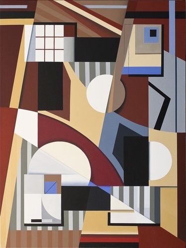
Non-objective abstraction offers a more radical proposition. Instead of illustrating a band, a lyric, or a narrative setting, it builds a visual system from color, shape, rhythm, tension, proportion, and silence. For an independent artist or label, this is not a retreat from communication. It is a way to communicate the intangible architecture of sound without forcing it into a literal picture. A carefully constructed abstract sleeve can suggest pressure, suspension, velocity, density, or release while leaving the listener enough space to complete the meaning.
Early twentieth-century innovators developed this approach by abandoning external representation and treating art as an autonomous field of sensations. Their experiments remain useful because they were not merely decorative. They asked how a composition could operate like music, how a visual structure could create expectation and dissonance, and how a limited vocabulary could generate an entire world. Modern indie labels can adapt that thinking into practical identity systems built from pure form, line, color, spacing, and repeatable rules.
The Philosophical Leap From Figuration to Pure Vibration
Abstraction is a broad category, but non-objective art is more specific. A simplified portrait or a distorted landscape still begins with something recognizable in the external world. Non-objective work does not depend on that source. It uses geometric forms, gestural marks, color relationships, and compositional forces without claiming to depict a person, place, or object. The distinction matters for music branding because a designer who merely simplifies a literal image is solving a different problem from one who constructs a visual equivalent for an emotional or sonic condition.
Canonical histories of abstract art describe this conceptual break as a movement away from recognizable forms toward autonomous visual elements. The shift was not a single clean revolution. Cubism fractured observed reality, Fauvism intensified color, and later artists pursued geometry or gesture with increasingly little connection to the visible world. For a record sleeve, the practical lesson is to identify which parts of the artwork need to explain and which parts should resonate. Recognition can come from a label mark, typography, or recurring layout, while the image itself remains open-ended.
Wassily Kandinsky made that openness central to his thinking. His response to Wagner”s Lohengrin at Moscow”s Bolshoi Theatre reportedly produced an overwhelming fusion of sound and color, helping redirect him from law toward painting. He associated musical qualities with visual ones, including a theory in which yellow could relate to the trumpet”s piercing energy, blue to inward or spiritual depth, and different colors to distinct psychological effects. His titles, including Composition and Improvisation, treated painting as an event with rhythm, structure, and emotional progression rather than as a window onto a scene.
Hilma af Klint pursued a parallel departure through spiritual, geometric, and diagrammatic forms. Trained at Stockholm”s Royal Academy of Fine Arts, she maintained a conventional figurative practice while privately developing non-figurative works influenced by spiritualism, Rosicrucianism, Theosophy, and Anthroposophy. Her group, The Five, explored séances, automatic writing, and drawing, while her later Paintings for the Temple comprised 193 works made between 1906 and 1915. The Hilma af Klint Foundation documents how much of this work remained outside mainstream exhibition culture during her lifetime, with broad recognition arriving decades after her death.
- Composition can establish a track”s hierarchy, climax, and movement.
- Chromatic tension can translate warmth, abrasion, melancholy, or brightness without illustrating a lyric.
- Negative space can create the equivalent of silence, suspension, or unresolved expectation.
- Repetition and variation can mirror loops, motifs, polyrhythms, and evolving arrangements.
Suprematism and the Architecture of Modern Sleeve Design
Kazimir Malevich pushed non-objective art toward what he called a zero-degree language of sensation. His 1915 presentation of a black square on a white canvas was deliberately confrontational, occupying the traditional corner position of a Russian Orthodox icon while replacing sacred imagery with geometric form. The gesture reduced painting to an encounter between shape, field, scale, and placement. Later Suprematist compositions introduced colored rectangles, diagonals, and floating forms, while the 1918 White on White paintings explored the tension between near-identical values.
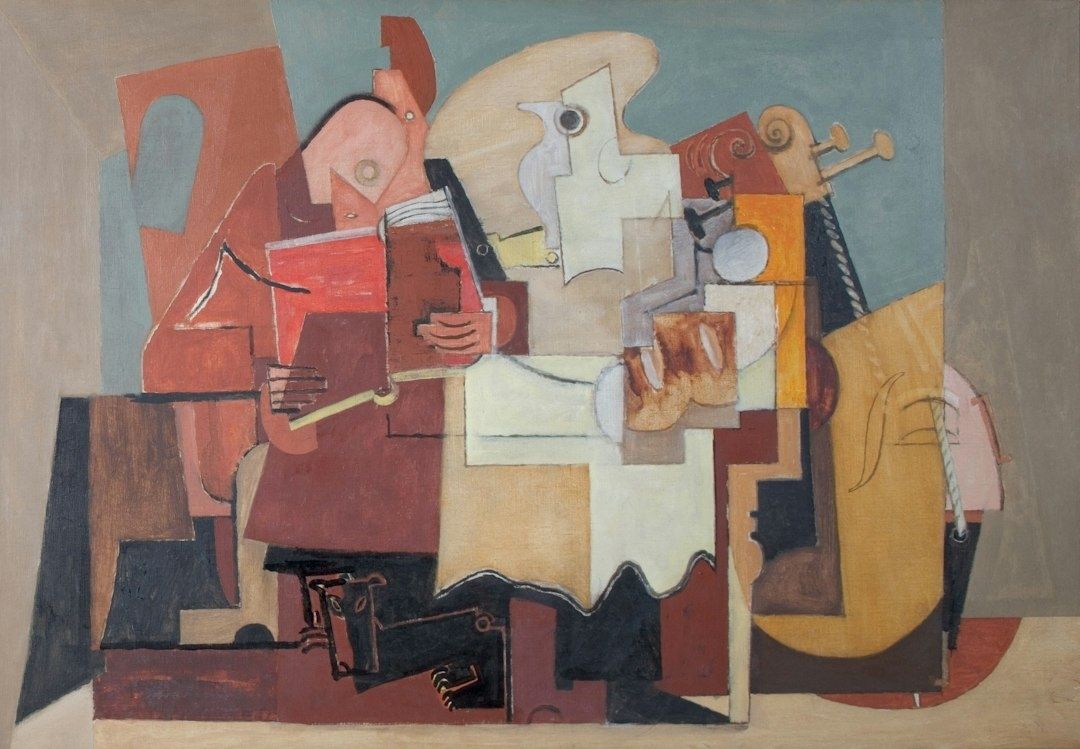
This history has a direct bearing on contemporary sleeve design. The electronic record, the ambient edition, and the post-punk seven-inch often rely on visual restraint because restraint creates room for listening. A single bar, offset square, or sharply divided field can become more memorable than an overloaded montage when it is repeated consistently across a catalog. The lineage from early non-objective experiments into modernist typography, Bauhaus abstraction, Swiss grids, and later music packaging is not a matter of copying old forms. It is a matter of adopting the principle that structure can carry identity.
The sociopolitical rupture surrounding early twentieth-century modernism also encouraged artists to search for forms that did not depend on inherited images of the material world. An academic analysis available through minds.wisc.edu places non-objective art within the technological, industrial, and social upheavals that weakened Renaissance assumptions about representation. For a contemporary label, the equivalent pressure comes from platform uniformity, rapid content production, and the expectation that every cover must perform instantly in a tiny square.
| Avant-garde principle | Contemporary packaging equivalent |
|---|---|
| Geometric form without depicted objects | A visual vocabulary that signals mood without showing a literal scene |
| White or restrained fields | Negative space that protects legibility at thumbnail size |
| Dynamic placement | Consistent rules for offsets, diagonals, crops, and motion graphics |
| Limited color relationships | A release palette that extends across sleeves, posts, merchandise, and stage visuals |
| Formal variation within a system | Distinct covers that still read as part of one label or artist catalog |
Visual restraint also gives the listener an open projective canvas. A literal cover dictates who, where, and what; an abstract one can establish emotional conditions without closing them down. That does not mean the design should be vague or careless. Its internal logic must be precise. The viewer should feel a relationship between scale, color, and placement even when no narrative is supplied.
Mapping Audio Frequencies to Non-Literal Formats
Translating sound into visual form begins with dynamics, not decoration. Sub-bass can be treated as mass, broad tonal fields, or low, grounded shapes. Fast transients may become narrow marks, abrupt edges, clustered lines, or high-contrast interruptions. A slow drone might require a nearly static field with minute tonal shifts, while a polyrhythmic track could be represented through overlapping grids that remain legible without becoming illustrative.
The strongest systems do not pretend that a color has one universal musical meaning. Yellow is not automatically bright pop, black is not automatically darkness, and a diagonal is not automatically aggression. Meaning emerges through relationships and repetition. A dense form beside a quiet field may communicate pressure; a warm color trapped inside a cool structure may suggest conflict; a repeated mark that gradually changes scale can imply development across an album.
Texture can function as timbre. Organic lithographic grain, paper fibers, photocopy noise, or brushed pigment can evoke saturation, instability, and human touch, while precise vector geometry can suggest sequencing, digital editing, and machine control. Combining both is especially effective for artists whose production moves between analog instruments and software. The key is to control the contrast. Texture should not become a generic vintage filter, and precision should not flatten the work into sterile interface graphics.
- Use visual weight to reflect low-frequency presence and harmonic density.
- Use line density to distinguish sparse arrangements from crowded ones.
- Use edge quality to separate smooth pads, distorted guitars, percussion, and clipped digital transients.
- Use repetition with measured variation to create a catalog language rather than a series of unrelated covers.
- Test the same visual grammar on vinyl gatefolds, shirts, posters, social crops, and streaming tiles.
Labels that build recognition through non-representational rules understand that identity is cumulative. A recurring grid, a particular crop, a fixed type position, or a signature relationship between one dominant shape and one empty field can become as recognizable as a logo. The system should survive different designers and releases. That is the difference between a one-off abstract image and a durable sonic brand.
A Four-Step Blueprint for Non-Objective Release Packaging
Non-objective design becomes commercially useful when it is translated into a repeatable process. The goal is not to remove intuition, but to give intuition a structure that can survive deadlines, revisions, formats, and collaborators. Each release should have enough freedom to feel alive, while the overall catalog should retain a visible point of view.
- Isolate the core dynamic tension. Before selecting colors or drawing shapes, describe what the music does physically. Is it built on polyrhythms, a sustained drone, a quiet-to-loud transformation, an unstable pulse, or the friction between acoustic warmth and digital precision? Choose one primary tension and one secondary counterforce. A record driven by slow bass and sudden percussion might use a broad grounded field interrupted by small, sharp marks. The image does not depict the drums; it makes their interruption felt.
- Restrict the palette to two or three communicative elements. Limit the initial system to a small number of decisions, such as value, hue temperature, and structural alignment. A dark field with one heated color and a strict diagonal may communicate more decisively than twelve effects layered without hierarchy. Restrictions also protect production efficiency. When a release moves from screen to ink, fabric, cardboard, and stage projection, a controlled palette is easier to reproduce and easier for audiences to remember.
- Stress-test the design across multiple scales. Examine the artwork as a 12-inch sleeve, a square streaming tile, a phone notification, a poster, and a small merchandise mark. Details that reward close viewing are valuable, but the dominant relationship must remain clear at thumbnail size. Confirm that artist name and title remain readable without overpowering the composition. For vinyl, check how the design behaves across the gatefold, spine, inner sleeve, and center label. For digital release, check the image in both bright and dark interface contexts.
- Establish scalable layout guidelines. Document the rules that make the identity portable. Specify margins, type placement, logo behavior, crop logic, color values, minimum line weights, and acceptable variations. Then extend the system into tour visuals, lyric cards, posters, ticket inserts, stickers, and press assets. Live visuals should not simply enlarge the cover. They should animate its underlying principles through slow drift, repetition, rotation, pulse, or controlled disruption.
A useful rulebook should be specific enough to guide a collaborator but flexible enough to prevent mechanical repetition. Define what cannot change, such as the relationship between the title and the primary form, then define what may change, such as texture, scale, or the number of repeated elements. This approach protects creative control while reducing production friction during a busy release rollout.
The design should also be tested against the realities of independent music operations. Can a small pressing run reproduce the colors? Can a label make social assets without asking the designer to rebuild every file? Can the artist use the system on stage without expensive custom fabrication? A visually ambitious identity becomes more valuable when it supports distribution, merchandising, audience recognition, and catalog growth instead of existing only as a beautiful master file.
Build Your Sonic Legacy on Pure Expression
Non-objective art remains powerful because it does not compete with crowded feeds by shouting a more literal message. It creates a distinct visual condition. In a market saturated with portraits, symbols, and polished renders, a disciplined field of color, a strange proportion, or a carefully placed mark can interrupt attention precisely because it refuses to explain everything. Its timelessness comes from structure rather than trend. Geometry, contrast, rhythm, and space can be reinterpreted across formats without losing their force.
Independent artists and labels should trust the listener”s intuition. A sleeve does not need to summarize the track, provide a complete storyline, or predict the audience”s interpretation. It needs to establish a credible world and invite entry. When every release uses form, line, color, and rhythm with intention, the artwork becomes more than packaging. It becomes a visual soundtrack, a durable part of the catalog, and an uncompromising statement about how the music wants to be heard.